Hey sales leaders: The way your ops team creates reports and dashboards is probably fine for forecasting, but it’s mostly useless for improving rep performance.
The “official” reports and dashboards created for sales orgs are almost always snapshots for the current quarter or fiscal year. They show the static number for the pipeline generated, the current ARR value of open opps per stage, the revenue won, the win rates, etc.
And when you’re trying to get an accurate forecast for how you’re gonna end the quarter or year, these static visualizations are usually the right approach.
But it’s virtually impossible to asses performance gaps with that kind of data. Looking at snapshot/static data, how would you know which specific reps need to improve on which specific things?
You wouldn’t.
If you want to extract actionable coaching insights from reports and dashboards, you need a different approach. The dataset can be the same, but the way you visualize the data has to be different.
If you’re leveraging reports and dashboard for the purposes of coaching and performance improvement, there are at least 3 requirements:
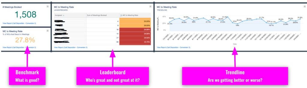
1. A benchmark for what “good” is. Knowing that a rep generated $725k in pipeline last last quarter is meaningless unless you know what they were supposed to have done.
2. A leaderboard. Who on the team is crushing it on this metrics and who needs the most help?
3. A trend line. Are things getting better or worse over time? This is a crucial one for enablement purposes, since the core purpose of enablement is to improve things over time.
Happy selling.
#heysalesleaders#salesexcellence